Togglescape is a term that goes back years. To put it mildly the term implies that there is a toggle for any conceivable option in RuneScape. While at the extreme end this is not true, there are still a great many questionable toggles in game. Toggles are not bad. The general sense of the community seems to be that you can have the game options as they are now or you can have no toggles. That's not true; there is a middle ground.
Toggles in software go back decades. Entire fields in software engineering exist that examine how to build an effective user interface and then further examine how to tailor it to individual users by way of options and toggles. A good toggle should expose new or different functionality without introducing excess complexity. This does not mean that toggles should provide access to entirely different designs. Now that we're aware of what software toggles represent, let's pivot to RuneScape.
RuneScape's toggles are quite simply egregious in some places. While they do make sense for someone who has been playing the game consistently or knows RuneScape like the back of their own hand, they can cause severe issues for newer players. What the rest of this article is going to do is run through some of the options available in RuneScape and pose ideas of how they could be removed or made more straight forward.
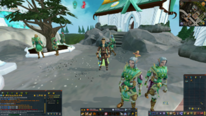
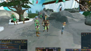
Camera Mode - This setting dates back to the launch of RuneScape 3 in 2013. When RuneScape 3 launched the camera positioning was slightly different than that of RuneScape 2. An option was provided to allow players to have the old camera. Had this setting not existed, 6 years after the fact would we remember the old camera positioning? No. This setting should be removed.

 Classic vs. Modern Camera
 - Tooltips were added to potions at the tail end of 2018. Potion tooltips are great and many items in-game already have tooltips. Either remove the option to turn off tooltips for consistency or allow all item tooltips to be turned off (though this would deprive gamers of an important source of information).
Drag & Drop Items from Inventory/Bank - With RuneScape 3 came the ability to customize your interfaces as you see fit. One of the paradigms this brought in was the ability to drag inventory panels around thus introducing the player to the concept of drag and drop. Drag and drop can already be used to move items from bank to inventory, worn, or familiar. It doesn't make sense to have a toggle to drag to drop or drag to destroy. As long as existing confirmations are honoured there should be no problem with drag to drop.
Hit Splat Colours - This toggle makes almost zero sense. Poison damage is green, disease orange, healing is purple, general damage is red, etc. Each damage type is associated with a colour from the beginning on tutorial island. Allowing the player to break this association effectively breaks the interface because interfaces are defined by convention and expectation. The only place this may make sense is for colour blind players, though a single colour blind option could be added to toggle problem colours.
Ability cool down timers - People who don't do combat may find this a useful option but for anyone who does do combat, removing timers will hurt combat effectiveness. Also, the timers are so small that they are one of the most unobtrusive things in RuneScape.
Activate regeneration when leaving combat - This option is toggled on for players who have been absent for 3 months or more. It will also be on for all new players. Folks who PvM regularly will want this option off as it is a common practice to build adrenaline before going into a fight to have thresholds or ultimates ready to activate. Remove the option to have it activate automatically and instead educate new and returning players on the purposes of orb buttons on the action bar.
Mining Stamina Bar - Launched after the Mining and Smithing rework of 2019 this bar was initially struck from the design. Why? There are three levels of stamina: 0, 1-99, and 100. Having a constantly updating bar for only 3 states is misrepresenting what's actually happening. We already have audio cues and visual cues (coloured sparks: green (100), white(1-99), none (0)) to indicate what level stamina we are mining at. There is no need for it and the team initially made the right decision. It should be removed.
Toggle receiving Geodes - This is one of the newest toggles to be added to the game in an effort to clean up inventories while mining. Geodes in general are a mess for the inventory and aren't worth much but other options should have been considered. These could include increasing the value of geodes or making some kind of pocket/sigil item that converts them into something more usable.
Toggle receiving Clue Scrolls - While geodes are generally going to be worthless unless they are metamorphic, clue scrolls are not. Clue scrolls at the very least allow the player to garner free items and clue scroll points. This toggle is an opt out of content toggle which in itself should be worrying for Jagex. Why is there not some kind of clue scroll eating device that rewards token experience, components or items? If not this then the player should make the active decision to not pick up clue scrolls.
Special note for the Slayer Counter
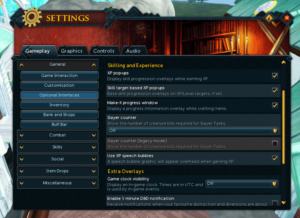
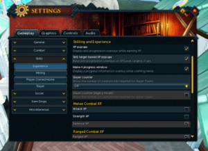
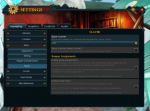
The option to enable a Slayer counter appears 3 times. The toggle for the Slayer counter appears in optional interfaces, Skills -> XP, and Slayer options. Looking to computer operating systems it is common for there to be multiple ways to access a settings interface, it is however not common to have the same setting in 3 places. The Slayer toggle is an interface option first and foremost and should only appear there, it doesn't outright affect the Slayer skill in terms of playability and it doesn't affect any other skills.
The three places where the Slayer counter can be activated.
Special note for Combat XP
The toggle for choosing what kind of combat XP you receive appears twice. First under Combat -> Combat XP and then under Skills -> XP. As with the previous toggle, you can access it multiple ways, but it really should only appear once. The combat settings menu is the most logical place. As a side note, this used to appear in the Powers root menu with the launch of RuneScape 3. It makes more sense to have this in a general combat settings interface.
These are a series of toggles that could be modified or removed entirely. The idea to write on this began before the game started receiving changes for mobile. The move to mobile has helped in terms of slimming down some of the game settings. Toggles are a subjective subject since RuneScape players are creatures of habit. At the end of the day a discussion on togglescape is warranted and an active review of the in-place settings would do wonders for usability.


