This week
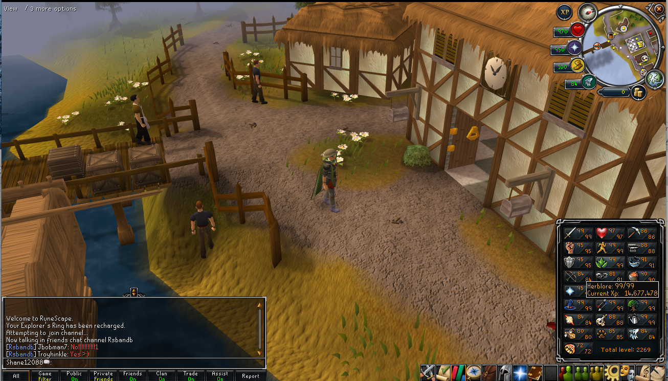
Jagex released an update(
screenshot) to RuneScape that further changed the in game interface. However, that is not what we're going to be talking about this month. The update did provide a springboard into this topic though, because later this Spring I'll be doing another article on the RuneScape interface. Today I want to talk about what a user interface should be and some key pillars of interface design. From that I'll provide some examples and leave the discussion up to you to determine what types of interfaces you prefer.
First off as a reminder from
The RuneScape GUI article the user interface is the link between the programmers logic and the user. Without a user interface the application would most likely be completely incomprehensible to the user. The user interface is all the user sees, they don't know what's going on within the logic of the program. Finally, in order for an application to be usable it must be paired with an interface that has a high degree of usability and a system that is relatively bug free.
Today we live in a world where user interfaces are constantly changing. Early user interfaces were inspired by real world objects, take for example the desktop. The user desktop is the same thing as a real world desktop, it provides most of the same functionality for files on your computer. Over the past couple of years new interface trends have come from the mobile operating system space. Examples include certain iOS elements found in Mac OS X Lion and the Metro interface coming to Windows 8 inspired by Windows Phone. Desktop application developers have also taken trends from mobile applications and brought them to their platform, Twitter for Mac as an example uses pull to refresh which was first present on their iOS application.
With the huge influx of new user interface ideas it's sometimes easy to get swept up into a new interface trend. For example, Apple learnt that multi-touch works nicely on their mobile platform and thus decided to include small elements of multi-touch in Mac OS X. Multi-touch isn't required in Mac SO X but it nicely augments the experience if the user has the appropriate hardware. Windows 8 is still a ways away but bringing the metro interface to the desktop as a main option may be going too far, we'll see. These two examples show how user interfaces change in the modern era of fast design and iteration, but more importantly they highlight a few important aspects of interface design that I want to talk about: consistency, metaphors, the mental model, and responsiveness of the interface.
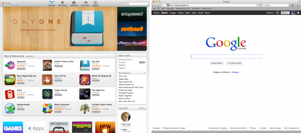
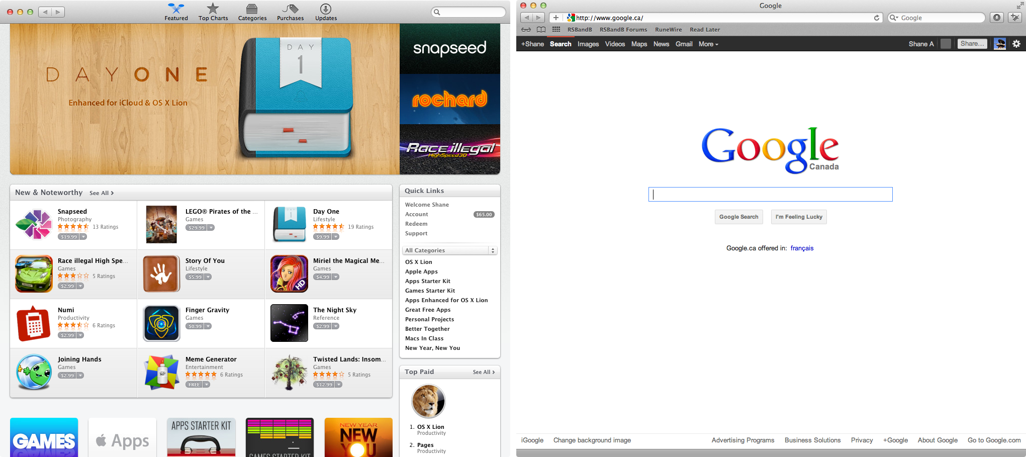
We've all been to a website that looked like it walked out of 1996 with each page having a different structural layout. Think of this as the general idea of what inconsistency in a user interface would look like. Most time it's not an issue if a developer is using window elements provided directly by the operating system but there's no limitation preventing what a developer may choose to do with their free time. The idea behind is to ensure the user has a similar experience wherever they are. This might be one pane or another in an application, it could be one application your desktop compared to another application; it entirely depends on the context of where the interface in question resides. Since the single application developers are the lowest common denominator it becomes the developers responsibility to ensure the application is consistent with the rest of the platform. Before I highlight examples it's important to note that consistency is important both for looks and the general structure of the application in question. As an example on Mac OS X: Apple uses a thick titlebar for the App Store and a thin titlebar for other windows.
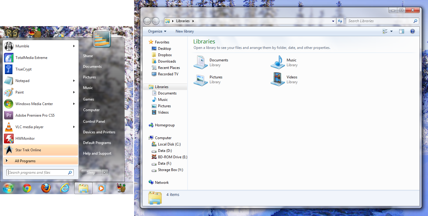
There are others but I feel this illustrates the issue perfectly. Here's an example from Windows 7 with the Start Menu compared to other Windows (excuse the crop). Notice the difference?

You'll notice that the start menu is lacking a drop shadow and does not have properly rounded corners. There are other areas of inconsistency in both operating systems, if you're interested in those please participate in the discussion for this article.
Remember your early English classes featuring figures of speech, specifically the metaphor? Metaphors are important because they enable a user to have a general idea of what an item might do in your user interface. A file on your desktop is a metaphor for an actual file in the real world that you'd store in a folder somewhere in a filing cabinet, while in reality a file is a stream of bytes on your hard drive that is formatted when you trigger it in a specific way. Metaphors are a critical component of defining the way a user interface will work. Without metaphors there's no way that a developer can make a connection between something the user already knows and the application in question.
Once a designer has decided on what metaphors will be used, it's important to decide how these fit into the flow of the application. The flow of the application could be defined in an arbitrary manner but this would not be conducive to the users experience. This is where another term comes in, mental model. A mental model is a way to visualize a certain task. A mental model example might be dragging an item to the trash to initialize the delete action which in practice is a great deal more complex than the dragging operation is. Mental models are key because they enable complex tasks to be made simpler. Mental models are then eased by previously described metaphors. Metaphors then rely on the consistency of other applications to enforce the established metaphors system wide.
Aside from designing the user interface to be as easy to use as possible as described in the previous paragraphs, the interface also needs to be aware of the calling program. It'd make sense to have a user interface respond properly when something is changed in the program, we can program this in and it's most often always implemented. What is sometimes not implemented is the appropriate feedback while the program is working or taking slightly longer to respond. A good example of an interface being responsive is a web browser spinning an icon to indicate that a page is being fetched. The whole idea of the interface changing to user inputs and changes in program state is unsurprisingly called, responsiveness. A responsive interface is just as important as having an interface that is consistent with decent metaphors accompanied by an adequate mental model.
In this article I've laid out a good description of basic user interface design. Basics are key and without them the interface will go nowhere. This article came up as mentioned because of Jagex's game update this week but also because I've been working on an application of my own for Mac OS X. I hope this has proved interesting to you and gave you an idea of the starting point for all user interfaces on the computer. I would love to hear your thoughts on this matter and whether it's important to you or not. Also, does it annoy you when applications aren't behaving in line with the rest of the operating system?
This was originally posted as an
Informer Tech article.


