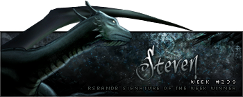
Week 239 Winner
Steven took out his very first win last week with this signature:
Congratulations! Here's your trophy:
Week 240 Voting
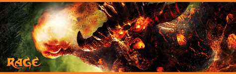
Theme: none; no animation.
| Runescape Bits & Bytes https://www.rsbandb.com/forums/ |
|
| SOTW: Week 240 Voting https://www.rsbandb.com/forums/viewtopic.php?f=47&t=78236 |
Page 1 of 1 |
| Author: | Chief Snake [ January 30th, 2010, 6:45 am ] |
| Post subject: | SOTW: Week 240 Voting |
Week 239 Winner Steven took out his very first win last week with this signature: Congratulations! Here's your trophy: Week 240 Voting Theme: none; no animation. |
|
| Author: | Adbot [ January 30th, 2010, 6:45 am ] |
| Post subject: | Register and login to get these in-post ads to disappear |
| Author: | Sev [ January 30th, 2010, 7:56 am ] |
| Post subject: | Re: SOTW: Week 240 Voting |
Easily Number 2. I love the colors and the 'mood' of this signature. |
|
| Author: | Tim [ January 30th, 2010, 9:37 am ] |
| Post subject: | Re: SOTW: Week 240 Voting |
This week 1 is the best from my perspective. I really like it. |
|
| Author: | Duke Juker [ January 30th, 2010, 6:06 pm ] |
| Post subject: | Re: SOTW: Week 240 Voting |
All of them look good, but I have to agree that 2 sticks out to me more this week. The color and detail are very nice. The other two, though, are also very good in detail and the background. Still, I'm sticking with 2 as the best. |
|
| Author: | Burnt Joint [ January 30th, 2010, 7:19 pm ] |
| Post subject: | Re: SOTW: Week 240 Voting |
1-looks very good, but the border things don't suit it. You don't need them to make a good signature. 2-looks very messy, the lights and colours draw us away from the main focus of the signature. 3-looks pretty good. You need some practice, but keep it up and you'll eventually find a style that you're comfortable with and you'll be able to build on it. |
|
| Author: | Xbladez [ January 30th, 2010, 10:31 pm ] |
| Post subject: | Re: SOTW: Week 240 Voting |
#1 while it has some nice effects overlaid upon the stock doesn't really have much work put into it outside of cropping that section of the original picture. #2 tho a bit cluttered has a nice flow to it, tho makes me wonder what the girl was cut out of with her hands tied like that... #3 the text is a bit garbled, the lighting makes it appear far to faded to the point that you cant really tell what all is there besides the guy. toss up between 1 & 2 *flips a coin* |
|
| Author: | Adbot [ January 30th, 2010, 10:31 pm ] |
| Post subject: | Register and login to get these in-post ads to disappear |
| Author: | Kenny [ January 31st, 2010, 1:15 am ] |
| Post subject: | Re: SOTW: Week 240 Voting |
For me, #1 is the best but there's something really annoying me about it but I don't know what. I think it looks overly blurred but oh well still got my vote. |
|
| Author: | jsbrules2 [ January 31st, 2010, 2:45 pm ] |
| Post subject: | Re: SOTW: Week 240 Voting |
#1, only critisism is the hair is a lil too long... |
|
| Author: | Killjoy [ January 31st, 2010, 3:27 pm ] |
| Post subject: | Re: SOTW: Week 240 Voting |
jsbrules2 wrote: #1, only critisism is the hair is a lil too long... That's not his doing. That would be the stock. Most people don't change their stocks unless they are good at photomanipulation. |
|
| Author: | Cnbc-e985 [ February 2nd, 2010, 3:48 am ] |
| Post subject: | Re: SOTW: Week 240 Voting |
I want #2. |
|
| Page 1 of 1 | All times are UTC - 7 hours |
| Powered by phpBB® Forum Software © phpBB Group http://www.phpbb.com/ |
|

