Week 238 Winner
Having just won his first SOTW in 140 weeks, Hairy Munky returns for his second week in a row with this one:
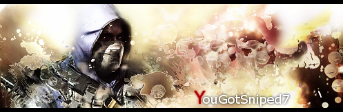
Congratulations on #6

Week 239 Voting
Theme: none; animation allowed.
| Runescape Bits & Bytes https://www.rsbandb.com/forums/ |
|
| SOTW: Week 239 Voting https://www.rsbandb.com/forums/viewtopic.php?f=47&t=78191 |
Page 1 of 1 |
| Author: | Chief Snake [ January 24th, 2010, 11:41 pm ] |
| Post subject: | SOTW: Week 239 Voting |
Week 238 Winner Having just won his first SOTW in 140 weeks, Hairy Munky returns for his second week in a row with this one: Congratulations on #6 Week 239 Voting Theme: none; animation allowed. |
|
| Author: | Adbot [ January 24th, 2010, 11:41 pm ] |
| Post subject: | Register and login to get these in-post ads to disappear |
| Author: | Tim [ January 25th, 2010, 12:12 am ] |
| Post subject: | Re: SOTW: Week 238 Voting |
This week my vote is for #3, It is very well done in my opinion. |
|
| Author: | Shwa [ January 25th, 2010, 12:44 am ] |
| Post subject: | Re: SOTW: Week 238 Voting |
I also like #3 the best as well. It is definitely the most well done of all of them. |
|
| Author: | Steven [ January 25th, 2010, 2:23 am ] |
| Post subject: | Re: SOTW: Week 238 Voting |
#1 is okay... It's not exactly SOTW Win worthy, but it's okay. I'd suggest trying to put some more things on there, such as a background that matches the render. Taking a render and putting it on a black background is really not appealing. #2 is really good Munky, but the one thing that bugs me about it is the choppiness of the render. It's really not that good of a render. Another thing that bothers me is the eraser stroke through his hand. I wouldn't be able to tell it was there if it wasn't for the outline of his fist that was there, lol. Also, the C4D that's going around his sword is pretty well placed. PS: Did you erase part of the blade or is it like a really small knife or something? xD Really well done, though. #3 Is my sig, and I don't want to praise myself or look like I like it the most, so I'll let you guys judge it. #4 Pretty good, Sev. I like it, and it looks really good, but it looks to small in my opinion. Perhaps had you made it bigger, it'd be better. |
|
| Author: | Hairy Munky [ January 25th, 2010, 3:36 am ] |
| Post subject: | Re: SOTW: Week 238 Voting |
Steven wrote: #2 is really good Munky, but the one thing that bugs me about it is the choppiness of the render. It's really not that good of a render. Another thing that bothers me is the eraser stroke through his hand. I wouldn't be able to tell it was there if it wasn't for the outline of his fist that was there, lol. Also, the C4D that's going around his sword is pretty well placed. PS: Did you erase part of the blade or is it like a really small knife or something? xD Really well done, though. I didn't use a render, I used a wallpaper as stock. http://img211.imageshack.us/img211/6538 ... ippudenwallpapec.jpg His hand is just a by-product of all the blurring and smudging I did I guess, I agree it doesn't look particularly good. I'm guess what you think is a C4D on his sword is actually his sword and is on the original render and the wallpaper. |
|
| Author: | Steven [ January 25th, 2010, 3:40 am ] |
| Post subject: | Re: SOTW: Week 238 Voting |
Hairy Munky wrote: Steven wrote: #2 is really good Munky, but the one thing that bugs me about it is the choppiness of the render. It's really not that good of a render. Another thing that bothers me is the eraser stroke through his hand. I wouldn't be able to tell it was there if it wasn't for the outline of his fist that was there, lol. Also, the C4D that's going around his sword is pretty well placed. PS: Did you erase part of the blade or is it like a really small knife or something? xD Really well done, though. I didn't use a render, I used a wallpaper as stock. http://img211.imageshack.us/img211/6538 ... ippudenwallpapec.jpg His hand is just a by-product of all the blurring and smudging I did I guess, I agree it doesn't look particularly good. I'm guess what you think is a C4D on his sword is actually his sword and is on the original render and the wallpaper. Ohh. Well, that answers a lot of questions, then. PS: You have amazing GIMP skills. |
|
| Author: | Adbot [ January 25th, 2010, 3:40 am ] |
| Post subject: | Register and login to get these in-post ads to disappear |
| Author: | Tim [ January 25th, 2010, 9:55 am ] |
| Post subject: | Re: SOTW: Week 238 Voting |
A question about Sev's Sig, Which Halo is that picture from? To me it looks like the beginning of the Halo Reach tralier, but I could be wrong. |
|
| Author: | Iron Maiden [ January 25th, 2010, 11:41 am ] |
| Post subject: | Re: SOTW: Week 238 Voting |
#2 is amazing. #3 is excellent. Don't know for which one I'll vote. But it's between one of you guys. |
|
| Author: | Steven [ January 25th, 2010, 5:44 pm ] |
| Post subject: | Re: SOTW: Week 238 Voting |
Mli 699 wrote: A question about Sev's Sig, Which Halo is that picture from? To me it looks like the beginning of the Halo Reach tralier, but I could be wrong. Yes, it is the beginning of the Halo: Reach trailer. |
|
| Author: | rs josec78 [ January 25th, 2010, 11:34 pm ] |
| Post subject: | Re: SOTW: Week 238 Voting |
#3 is a pretty cool sig. I think I'll vote for that one. |
|
| Author: | fr0styb0w [ January 26th, 2010, 8:54 pm ] |
| Post subject: | Re: SOTW: Week 238 Voting |
They were all nice and well done but #3 stood out from the rest |
|
| Author: | Italy4life [ January 26th, 2010, 9:12 pm ] |
| Post subject: | Re: SOTW: Week 238 Voting |
#3 really was the best out of 4 pretty good sigs |
|
| Author: | Mushroom Queen [ January 27th, 2010, 2:40 pm ] |
| Post subject: | Re: SOTW: Week 238 Voting |
You know, I'm not going on a rant here. I know why things are the way they are with SOTW and that it was the best course of action. But I **** miss the SOTW team. 12 people have voted for #3 and 5 have voted for #4 so far. #3 is based off of this wallpaper: http://static.desktopnexus.com/download/inline/92461/. And #4 is based off of a video still: http://www.youtube.com/watch?v=YWGeB1564Xw (~2:40). Now, I got onto Sev's back about using a painted effect on one of his other signatures, but you can see how well it works here. How well these colours have been re-added to the render, as well as texture, and text..wow. It looks like it rose up out of the fog. The whole sig just falls together beautifully. As for #3 (I'm not out to offend you, Steven), it just looks like it was, more or less, cropped from the original wallpaper. A little white was added, and the saturation was played with, and then an orange border and some text were added. My point is that, most of these people who are voting (and I don't mean just this SOTW) seem to only be capable of thinking in terms of "Oh, this looks cool". Real work or creativity isn't rewarded by these people because they can't recognise it. And there really isn't anything anyone can do about it. Perhaps adding a link to the original render might help? I have no idea. |
|
| Page 1 of 1 | All times are UTC - 7 hours |
| Powered by phpBB® Forum Software © phpBB Group http://www.phpbb.com/ |
|


