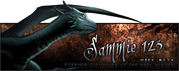
Week 234 Winner
Right, I made sure that I checked to get it right this time... this week was won by Sammie 123!
A proper congratulations now... here's your actual sixth trophy.
Week 235 Voting
Theme: none; no animation.
Quote:
| Runescape Bits & Bytes https://www.rsbandb.com/forums/ |
|
| SOTW: Week 235 Voting https://www.rsbandb.com/forums/viewtopic.php?f=47&t=77770 |
Page 1 of 1 |
| Author: | Chief Snake [ December 20th, 2009, 3:09 am ] |
| Post subject: | SOTW: Week 235 Voting |
Week 234 Winner Right, I made sure that I checked to get it right this time... this week was won by Sammie 123! A proper congratulations now... here's your actual sixth trophy. Week 235 Voting Theme: none; no animation. Quote: |
|
| Author: | Adbot [ December 20th, 2009, 3:09 am ] |
| Post subject: | Register and login to get these in-post ads to disappear |
| Author: | Steven [ December 20th, 2009, 6:55 am ] |
| Post subject: | Re: SOTW: Week 235 Voting |
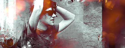
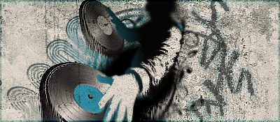
#1 is pretty basic, I probably wouldn't even call it a signature. It's more like a yellow line going through the whole screen with a few bits of text here and there. #2 is better than #1, but the opacity on the render is WAY too low, you can't even see it that well. I think it's a dragon, but I can't tell. Lower the opacity on the render and then we might be able to see a real sig. #3 is another genuine Humus signature. Not much to say than the fact that it's excellent and that it blew my signature out of the water. #4 is my sig, isn't it? I'll let you guys critic my signature. #5 is a great signature. The lighting on it is fantastic. It'll probably be him who wins, due to the fact as he is the current leader in RSBandB's SOTW Wins, but hey, it's a good challenge. #6 is pretty good, I would have made the signature less small and fill up the space a bit more. It looks really empty. Otherwise it would be really good. Tough week this week. I'm going to debate on who to vote on for a little while. I'll edit my post when I voted. Good luck, everyone! |
|
| Author: | Flash [ December 20th, 2009, 10:57 am ] |
| Post subject: | Re: SOTW: Week 235 Voting |
Well, I choose #6 because it looks fantastic in my opinion. |
|
| Author: | Magnegnagan [ December 20th, 2009, 10:19 pm ] |
| Post subject: | Re: SOTW: Week 235 Voting |
Steven wrote: #1 is pretty basic, I probably wouldn't even call it a signature. It's more like a yellow line going through the whole screen with a few bits of text here and there. #2 is better than #1, but the opacity on the render is WAY too low, you can't even see it that well. I think it's a dragon, but I can't tell. Lower the opacity on the render and then we might be able to see a real sig. #3 is another genuine Humus signature. Not much to say than the fact that it's excellent and that it blew my signature out of the water. #4 is my sig, isn't it? I'll let you guys critic my signature. #5 is a great signature. The lighting on it is fantastic. It'll probably be him who wins, due to the fact as he is the current leader in RSBandB's SOTW Wins, but hey, it's a good challenge. #6 is pretty good, I would have made the signature less small and fill up the space a bit more. It looks really empty. Otherwise it would be really good. Tough week this week. I'm going to debate on who to vote on for a little while. I'll edit my post when I voted. Good luck, everyone! its not a render it's all brush and pencil. |
|
| Author: | rs josec78 [ December 20th, 2009, 10:26 pm ] |
| Post subject: | Re: SOTW: Week 235 Voting |
I thought 6 was pretty cool. |
|
| Author: | Italy4life [ December 20th, 2009, 10:55 pm ] |
| Post subject: | Re: SOTW: Week 235 Voting |
voted for 6 |
|
| Author: | Adbot [ December 20th, 2009, 10:55 pm ] |
| Post subject: | Register and login to get these in-post ads to disappear |
| Author: | Sammie 123 [ December 21st, 2009, 6:53 am ] |
| Post subject: | Re: SOTW: Week 235 Voting |
hehe chief snake... last time I thought my eyes might have misled me. I was like wtf was I trippin last night or something?! I voted for number 4. I don't know why it is the one that stood out the most to me. They are all very nice though. |
|
| Author: | Arb 67 [ December 22nd, 2009, 4:17 pm ] |
| Post subject: | Re: SOTW: Week 235 Voting |
i voted for 4 it looks pretty cool to me |
|
| Author: | Mushroom Queen [ December 23rd, 2009, 12:06 am ] |
| Post subject: | Re: SOTW: Week 235 Voting |
#5 shows an excellent amount of control with the render and background. I like the sort of smoky look to it. |
|
| Author: | -_+ totojimbob +_- [ December 26th, 2009, 11:14 am ] |
| Post subject: | Re: SOTW: Week 235 Voting |
Really good selection this week. I'm voting for 5 because of how nicely the effects fit the render. |
|
| Author: | Matthew [ December 26th, 2009, 11:26 am ] |
| Post subject: | Re: SOTW: Week 235 Voting |
#3, best one in my opinion. 2 is meh, 6 looks just like large scanlines with something around the render. |
|
| Author: | Tim [ December 31st, 2009, 9:16 pm ] |
| Post subject: | Re: SOTW: Week 235 Voting |
I really liked #3, good job. |
|
| Page 1 of 1 | All times are UTC - 7 hours |
| Powered by phpBB® Forum Software © phpBB Group http://www.phpbb.com/ |
|