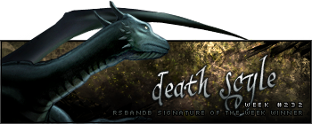
Week 232 Winner
Death_scyle took out last week's competition rather easily with this signature:
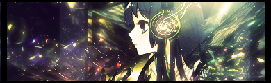
Well done! Here's your second trophy:
Week 233 Voting
Theme: Call of Duty; animation allowed.
Quote:
-

-
 (reuploaded from original link)
 -

-

| Runescape Bits & Bytes https://www.rsbandb.com/forums/ |
|
| SOTW: Week 233 Voting https://www.rsbandb.com/forums/viewtopic.php?f=47&t=77653 |
Page 1 of 2 |
| Author: | Chief Snake [ December 8th, 2009, 3:10 am ] |
| Post subject: | SOTW: Week 233 Voting |
Week 232 Winner Death_scyle took out last week's competition rather easily with this signature: Well done! Here's your second trophy: Week 233 Voting Theme: Call of Duty; animation allowed. Quote:
|
|
| Author: | Adbot [ December 8th, 2009, 3:10 am ] |
| Post subject: | Register and login to get these in-post ads to disappear |
| Author: | power crazy [ December 8th, 2009, 5:53 am ] |
| Post subject: | Re: SOTW: Week 233 Voting |
Voted for #1 because it looked coolest |
|
| Author: | Al3X [ December 8th, 2009, 12:18 pm ] |
| Post subject: | Re: SOTW: Week 233 Voting |
One and two look best, won't tell which one got my vote though Aside from bad cropping on the render, three is a bit too generic looking, sorry Maiden, you need to change up your style once in a while. Four isn't bad but doesn't make the cut for a SOTW winning entry in my opinion. Good luck everyone |
|
| Author: | Kenny [ December 9th, 2009, 1:00 am ] |
| Post subject: | Re: SOTW: Week 233 Voting |
I think #4 has a lot of potential, it's just a shame it's a bit too big and empty looking. #1 is ok but I still don't think it's worthy of a win. To be quite frank I'm getting a bit sick of seeing the same kind of background on every signature you make Maiden, you need to throw in a bit of variety, maybe change the font too. #3 is just another one of your sigs that looks the exact same as all the others but with different colour scheme and render. #2 is the best for me even though there is something that I can't put my finger on that is bugging me about it. Oh well. |
|
| Author: | Humus [ December 9th, 2009, 11:44 am ] |
| Post subject: | Re: SOTW: Week 233 Voting |
1 is very bland. Border, text and low-opacity render? Not good. 2 wouldn't be so bad if it weren't for the white light, but it just looks like a render with some C4Ds behind it. 3 is too dark and the render has no sort of blending whatsoever. The font is horrible, dunno about you but no amount of love for spiderman would make me want to use it. 4 isn't too bad, but the colours are too saturated, canvas size is waay too big, and the border doesn't work. Just a tip, guys. Don't put text on your signatures unless it REALLY looks good. I've seen so many tags ruined by bad text, and don't put your name on it unless it works, too. |
|
| Author: | Jay [ December 9th, 2009, 4:37 pm ] |
| Post subject: | Re: SOTW: Week 233 Voting |
I wish luck to all the entrants. Just noticed, I think the link to #2 is down. Something else that I need to get off of my chest: Humus wrote: 1 is very bland. Border, text and low-opacity render? Not good. 2 wouldn't be so bad if it weren't for the white light, but it just looks like a render with some C4Ds behind it. 3 is too dark and the render has no sort of blending whatsoever. The font is horrible, dunno about you but no amount of love for spiderman would make me want to use it. 4 isn't too bad, but the colours are too saturated, canvas size is waay too big, and the border doesn't work. Just a tip, guys. Don't put text on your signatures unless it REALLY looks good. I've seen so many tags ruined by bad text, and don't put your name on it unless it works, too. I'm sure you can get your critique across without a paragraph of insults. Last time I checked, critiques were about helping towards improvement, not discouraging the artist. Try telling someone how they can work on it without telling everyone how horrible they are. |
|
| Author: | Adbot [ December 9th, 2009, 4:37 pm ] |
| Post subject: | Register and login to get these in-post ads to disappear |
| Author: | Iron Maiden [ December 9th, 2009, 5:56 pm ] |
| Post subject: | Re: SOTW: Week 233 Voting |
Humus wrote: 1 is very bland. Border, text and low-opacity render? Not good. 2 wouldn't be so bad if it weren't for the white light, but it just looks like a render with some C4Ds behind it. 3 is too dark and the render has no sort of blending whatsoever. The font is horrible, dunno about you but no amount of love for spiderman would make me want to use it. 4 isn't too bad, but the colours are too saturated, canvas size is waay too big, and the border doesn't work. Just a tip, guys. Don't put text on your signatures unless it REALLY looks good. I've seen so many tags ruined by bad text, and don't put your name on it unless it works, too. I totally agree with Jay. Constructive critisms are use to give good and bad things about a work, not only bashing and screaming loud how bad they are. Who are you to say Jay's sig is ''not good''. A good exemple of critic would be the above posts, who are neutral in their opinion, they don't bring down the author, they give a suggestion to improve instead of free insulting. Not because YOU are good at making sigs means it gives you the right to bash others. I don't give a **** **** about what you think about my font or my sig. I chose the font because Spidey is my hero plus I wanted to use a font people would reconize and think ''Hey I know that font! It's Maiden's work!''. You have a problem with that? If you want to continue this, PM me, it will be a pleasure to answer, because it's not apropriate right here. Consider yourself lucky I can't allow myself one more warning because I would tell you the REAL truth. -- I really like them all. I like the blending on 1, the background on 2 and the font on 4. Together they'd make a perfect signature Good job guys |
|
| Author: | Jason [ December 9th, 2009, 6:08 pm ] |
| Post subject: | Re: SOTW: Week 233 Voting |
Jay wrote: I wish luck to all the entrants. Just noticed, I think the link to #2 is down. Something else that I need to get off of my chest: Humus wrote: 1 is very bland. Border, text and low-opacity render? Not good. 2 wouldn't be so bad if it weren't for the white light, but it just looks like a render with some C4Ds behind it. 3 is too dark and the render has no sort of blending whatsoever. The font is horrible, dunno about you but no amount of love for spiderman would make me want to use it. 4 isn't too bad, but the colours are too saturated, canvas size is waay too big, and the border doesn't work. Just a tip, guys. Don't put text on your signatures unless it REALLY looks good. I've seen so many tags ruined by bad text, and don't put your name on it unless it works, too. I'm sure you can get your critique across without a paragraph of insults. Last time I checked, critiques were about helping towards improvement, not discouraging the artist. Try telling someone how they can work on it without telling everyone how horrible they are. First off, I dont think you should be criticizing(bad spelling? idk) his post when you didn't come up with anything yourself. Attacking what he said is fine if you have you own followup. This is SOTW not "critique my sig plox" He is judging each sig for what it is worth. Now on to my opinion: Sig #1: Kinda boring. All that I see is the blue & white "cloud" over the render. I also agree that the text in this one hurts it overall. Sig #2: This one overall looks the best imo. Although you could have done more with the space on the left, what you did do looks pretty good. Sig #3: For some reason I dont really like the render. But aside from that, I like the design on the right side of the character. On the left though it is too "blah" and plain. I dont think the text is too big of a deal in this one but it could be better. Sorry of double posting. I forgot about 4 and it wouldn't let me edit. Hopefully a mod will help me out with this. (copy and paste the following on to my first post or something) Sig #4: Good sig. If you moved the words up 3/4 of the way up the page it would be perfect. This is because the green in the background kinda interfers with the text. |
|
| Author: | Jay [ December 9th, 2009, 7:13 pm ] |
| Post subject: | Re: SOTW: Week 233 Voting |
Since you want my opinion so much, I think everyone did well, I don't think anyone's was terrible. Mine could have used more color and originality. #2 was excellent, blending was right on,though a small bit of empty space could have been filled in. #3 had good color matching and brush use, the render could be blended better. I love the color stand-outs in #4, if it was smaller vertically would significantly improve it in my opinion. nikeballa435 wrote: First off, I dont think you should be criticizing(bad spelling? idk) his post when you didn't come up with anything yourself. Attacking what he said is fine if you have you own followup. This is SOTW not "critique my sig plox" He is judging each sig for what it is worth. Because I didn't call everyone's work terrible, bad, and generally degrade someone for the font they used? How you can read the other post and call mine an attack is beyond me. I don't remember critiquing anybodies' work either, why are you telling me not to? Attacking someone is never fine either, I don't know who gave you that idea. Judging each sig for what its worth by calling us terrible?... that isn't judging, that is called insulting. Maybe because it is. Your whole post contradicts itself. |
|
| Author: | The Killer [ December 9th, 2009, 8:19 pm ] |
| Post subject: | Re: SOTW: Week 233 Voting |
SOTW drama lol? it's just a contest with four contestants, why get so serious? #3 again impresses me, amazing use of text, and that soldier certainly evokes that feeling. |
|
| Author: | hummerwar921 [ December 9th, 2009, 9:08 pm ] |
| Post subject: | Re: SOTW: Week 233 Voting |
Ugh... looking back on 4, I realise I really shouldn't have submitted it I should have made it smaller, and added a render, and other stuff. But good luck everyone else |
|
| Author: | Sammie 123 [ December 10th, 2009, 2:26 am ] |
| Post subject: | Re: SOTW: Week 233 Voting |
I think I am the only one to notice this, I did not enter a signature contest last week and win, that was death sycle (sp) signature. I have not entered a contest in several weeks. |
|
| Author: | Chief Snake [ December 10th, 2009, 4:36 am ] |
| Post subject: | Re: SOTW: Week 233 Voting |
Sammie 123 wrote: I think I am the only one to notice this, I did not enter a signature contest last week and win, that was death sycle (sp) signature. I have not entered a contest in several weeks. Methinks your eyes doth deceive you... 
|
|
| Author: | Steven [ December 10th, 2009, 6:58 am ] |
| Post subject: | Re: SOTW: Week 233 Voting |
#1 isn't bad, but it doesn't have a chance against anything else in this SOTW. I'd recommend not letting your coloring for the signature go over the render. It would look better. #2 is going to win my vote for two reasons: It's really good, and it looks fantastic. I really like the C4Ds and how they draw your attention. #3 is a same old Maiden sig. Same text, same shadow, same style. No offense, Maiden, but you really need to change your style. I understand that you may not want to, but I highly recommend you do. The first three or so signatures with the same style were fine, and they looked fine, but after a while the style and such gets pretty dull. I know you put work into your signatures, and I know you like them, but I recommend you just open up Photoshop and just experiment. Try adding a border, try blending your render and stuff. That would be a start, and I'm sure you'd get better. Also, try using a different text. Spider Man may be your hero, and I understand that you'd like to use his text because of it's value to you, but I would like to tell you that you really need a new text. It really gets repetitive after awhile. But yeah, try out some tutorials, make your signatures have a border and stuff, and get a new text. That's a pretty fair and not offensive judging, wouldn't you think? #4 is pretty ... empty, is what I think I'm looking for. There's nothing wrong with it, but it's really big, and it just looks unappealing. Good luck to all of you. |
|
| Author: | Kenny [ December 10th, 2009, 10:17 am ] |
| Post subject: | Re: SOTW: Week 233 Voting |
Building on what have been said, Maiden you could maybe change your style of signatures but keep the font. That way people will still think that is Iron Maiden's signature but they won't think, oh god it's another render slammed on top of a C4D. |
|
| Page 1 of 2 | All times are UTC - 7 hours |
| Powered by phpBB® Forum Software © phpBB Group http://www.phpbb.com/ |
|