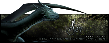
Week 222 Winner
Last week's fierce competition resulted in Sev's victory, his signature in the lead by just a single vote:

Goes to show that YOUR VOTE COUNTS!
Week 223 Voting
Theme: Bands/Musicians; no animation.
Quote:
| Runescape Bits & Bytes https://www.rsbandb.com/forums/ |
|
| SOTW: Week 223 Voting https://www.rsbandb.com/forums/viewtopic.php?f=47&t=76413 |
Page 1 of 1 |
| Author: | Chief Snake [ September 20th, 2009, 5:52 am ] |
| Post subject: | SOTW: Week 223 Voting |
Week 222 Winner Last week's fierce competition resulted in Sev's victory, his signature in the lead by just a single vote: Goes to show that YOUR VOTE COUNTS! Week 223 Voting Theme: Bands/Musicians; no animation. Quote: |
|
| Author: | Adbot [ September 20th, 2009, 5:52 am ] |
| Post subject: | Register and login to get these in-post ads to disappear |
| Author: | Sev [ September 20th, 2009, 9:38 am ] |
| Post subject: | Re: SOTW: Week 223 Voting |
Happy Palloooza, woo. Number 1 cause the other 2 don't feel like they had effort put in them. |
|
| Author: | power crazy [ September 20th, 2009, 9:42 am ] |
| Post subject: | Re: SOTW: Week 223 Voting |
I voted for #1, looks like cleanest and I can't even see #2 because it won't load. |
|
| Author: | Al3X [ September 21st, 2009, 12:59 pm ] |
| Post subject: | Re: SOTW: Week 223 Voting |
As much as I dislike Attack Attack, number one looks like it had the most effort put into it. The other two just look like stock pictures with text. |
|
| Author: | americigerm [ September 21st, 2009, 6:45 pm ] |
| Post subject: | Re: SOTW: Week 223 Voting |
Al3X wrote: As much as I dislike Attack Attack, number one looks like it had the most effort put into it. The other two just look like stock pictures with text. Dislike Attack Attack!? *Tear* |
|
| Author: | Sammie 123 [ September 21st, 2009, 8:52 pm ] |
| Post subject: | Re: SOTW: Week 223 Voting |
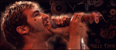
Al3X wrote: As much as I dislike Attack Attack, number one looks like it had the most effort put into it. The other two just look like stock pictures with text. #2 is a stock of sully erna from Godsmack, i cropped it out and made a render of it, the dics are a c4d, under the c4d is a background i made so the dics matched the same color as sully, he was a little on the redder side Just Saying, :p |
|
| Author: | Adbot [ September 21st, 2009, 8:52 pm ] |
| Post subject: | Register and login to get these in-post ads to disappear |
| Author: | Marking22 [ September 21st, 2009, 10:15 pm ] |
| Post subject: | Re: SOTW: Week 223 Voting |
sorry number 2 looks the best to me and it seems the hardest with all the diff items in the background |
|
| Author: | ChrisT [ September 22nd, 2009, 12:37 pm ] |
| Post subject: | Re: SOTW: Week 223 Voting |
Godsmack ftw...not only cause i like them though. #1 looked like a commercial on a music channel and not all that nicely done as #2. and yea #3 has nice shadow layers but the txt ruined it atleast for me :/ so hope sully wins |
|
| Author: | colinsoccer123 [ September 23rd, 2009, 4:41 am ] |
| Post subject: | Re: SOTW: Week 223 Voting |
Number two looks really nice, a tiny bit better than 1 imo. |
|
| Author: | Unbirthday [ September 23rd, 2009, 7:33 am ] |
| Post subject: | Re: SOTW: Week 223 Voting |
I voted for #1. I wish there had been a better turnout. |
|
| Page 1 of 1 | All times are UTC - 7 hours |
| Powered by phpBB® Forum Software © phpBB Group http://www.phpbb.com/ |
|