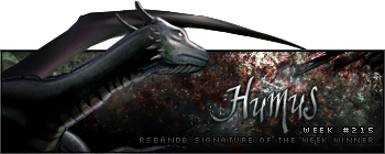
Week 215 Winner
Humus returns to steal the show again this week with a very colourful personal favourite of mine...

Congratulations on your twelfth win!
Week 216 Voting
Theme: Fire; animation allowed.
Quote:
| Runescape Bits & Bytes https://www.rsbandb.com/forums/ |
|
| SOTW: Week 216 Voting https://www.rsbandb.com/forums/viewtopic.php?f=47&t=75723 |
Page 1 of 1 |
| Author: | Chief Snake [ August 2nd, 2009, 6:45 am ] |
| Post subject: | SOTW: Week 216 Voting |
Week 215 Winner Humus returns to steal the show again this week with a very colourful personal favourite of mine... Congratulations on your twelfth win! Week 216 Voting Theme: Fire; animation allowed. Quote: |
|
| Author: | Adbot [ August 2nd, 2009, 6:45 am ] |
| Post subject: | Register and login to get these in-post ads to disappear |
| Author: | Killjoy [ August 2nd, 2009, 7:58 am ] |
| Post subject: | Re: SOTW: Week 216 Voting |
Number 5 looks the best to me. |
|
| Author: | Humus [ August 2nd, 2009, 10:33 am ] |
| Post subject: | Re: SOTW: Week 216 Voting |
Yaaay :B Thanks to anyone who voted for me. As for this week, 3 looked great to me. Everything looked great except for the text. But nevermind Jaden's was very close behind. |
|
| Author: | The Killer [ August 2nd, 2009, 10:35 am ] |
| Post subject: | Re: SOTW: Week 216 Voting |
5 is excellent 3 isnt even fire its just a marine on an orange background the way i see it |
|
| Author: | Tim [ August 2nd, 2009, 12:27 pm ] |
| Post subject: | Re: SOTW: Week 216 Voting |
I like 3 the most, it just stands out to me. |
|
| Author: | Jaden [ August 2nd, 2009, 4:54 pm ] |
| Post subject: | Re: SOTW: Week 216 Voting |
3 cause it is thee. The best |
|
| Author: | Adbot [ August 2nd, 2009, 4:54 pm ] |
| Post subject: | Register and login to get these in-post ads to disappear |
| Author: | isaiahzsa1 [ August 2nd, 2009, 5:08 pm ] |
| Post subject: | Re: SOTW: Week 216 Voting |
they are all so good, I cant decide so I wont be voting but good job to all you guys! |
|
| Author: | Marking22 [ August 2nd, 2009, 8:03 pm ] |
| Post subject: | Re: SOTW: Week 216 Voting |
yeah number 3 seems the best to me |
|
| Author: | Chief Snake [ August 2nd, 2009, 9:09 pm ] |
| Post subject: | Re: SOTW: Week 216 Voting |
Humus wrote: As for this week, 3 looked great to me. Everything looked great except for the text. But nevermind Jaden's was very close behind. Agreed. Well done, Sev. |
|
| Author: | Mushroom Queen [ August 3rd, 2009, 1:59 am ] |
| Post subject: | Re: SOTW: Week 216 Voting |
I'm going to do it like t'old SOTW judges did it back in the day because I think that every one of these sigs deserves some critique (and there's only a few of them, so I don't have to write a ton). 1. This one has a really good background, but it suffers from the tragic fact that it's REALLY tiny. I don't really get a chance to see pretty details and stuff when it's at that low of a resolution. I don't really care for the light spot near the top of the render's head. I feel like it cheapens the look. Text is a big deal for me and this sig's text is nearly unrecognisable. So, I don't know. A combination of things caused me to not vote for this sig. As much as I <3 Jaden's stuff. 2. While cutting out the render, too large of a soft-eraser was used. That leaves the edges looking too feathery and non-realistic. Next time, try using a smaller harder brush when doing that. This is is much too saturated and it really clashes with the softness of the render. However, I must say that I realllly like the concept for this. I think it was a good idea, but it wasn't done as well as it could be. 3. I told Sev in a thread in Graphics Central that he's getting so much better at making signatures and this is proof. The background is stunning and it gives just the right balance of contrast against the render. Nearly everything in this signature was well put together and that's why it's getting my vote. The only thing that I found less appealing was that the text is so faint. I feel that using a fiery effect on the SC logo would have been so much more awesome. 4. Is that the American flag burning? O.o It's not a bad sig, by any means. But the font of the text doesn't really do it for me and the colours of the sig just..aren't really vibrant and fiery. 5. A ton of awesome things can be done with this render, but the edges of the flames in conjunction with the bright background bring out the grey edges of the render. Something darker would have been better to see and maybe a different font. I see you use that font a lot, Iron Maiden. Time to switch it up TL;DR I voted for 3. |
|
| Author: | Iron Maiden [ August 3rd, 2009, 7:12 am ] |
| Post subject: | Re: SOTW: Week 216 Voting |
Mushroom Queen wrote: I see you use that font a lot, Iron Maiden. Time to switch it up NO! Lol this font is like a signature for me, Like it was signed by me. But yeah you're right, I've abused it Epic huh? XD |
|
| Author: | Italy4life [ August 4th, 2009, 5:18 pm ] |
| Post subject: | Re: SOTW: Week 216 Voting |
i personally like number 3 not sure what it is but it looks nice. |
|
| Page 1 of 1 | All times are UTC - 7 hours |
| Powered by phpBB® Forum Software © phpBB Group http://www.phpbb.com/ |
|


