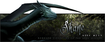
Week 209 Winner
Shane has claimed his third SOTW win with this rather fruitful signature:
Congratulations poppit. Here is your trophy:
Week 210 Voting
No theme; no animation.
Quote:


Bit better turnout this week. Good work guys.
| Runescape Bits & Bytes https://www.rsbandb.com/forums/ |
|
| SOTW: Week 210 Voting https://www.rsbandb.com/forums/viewtopic.php?f=47&t=75004 |
Page 1 of 1 |
| Author: | Chief Snake [ June 20th, 2009, 7:17 am ] |
| Post subject: | SOTW: Week 210 Voting |
Week 209 Winner Shane has claimed his third SOTW win with this rather fruitful signature: Congratulations poppit. Here is your trophy: Week 210 Voting No theme; no animation. Quote: Bit better turnout this week. Good work guys. |
|
| Author: | Adbot [ June 20th, 2009, 7:17 am ] |
| Post subject: | Register and login to get these in-post ads to disappear |
| Author: | Killjoy [ June 20th, 2009, 7:39 am ] |
| Post subject: | Re: SOTW: Week 210 Voting |
I have to go with number one. Its sooo good. I also like Kirbys but 1 wins it for me. |
|
| Author: | Tim [ June 20th, 2009, 7:46 am ] |
| Post subject: | Re: SOTW: Week 210 Voting |
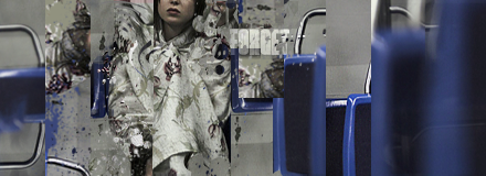
Number 5 is honestly the best one there because it's simple. Number 2... I have nothing to say, Kirby's was going to be the one I was going to pick but Shreder's signature is personally, much better, Number 3 and 5 are the exact same thing and I've seen way to much about it. And one was very close behind number 4, but number 4 to me, was very well done. Good job! 
|
|
| Author: | Owen1892 [ June 20th, 2009, 10:55 am ] |
| Post subject: | Re: SOTW: Week 210 Voting |
Wow lots of entries this week. I like number 4, the green looks good at the background. |
|
| Author: | Iron Maiden [ June 21st, 2009, 8:09 am ] |
| Post subject: | Re: SOTW: Week 210 Voting |
So, I will give an opinion for each of the sigs. 1 - It's cool yes but there is something wrong. Is it me or your style is *almost* always the same? I'd try to varie my style a bit, but well done. That's a cool style anyways 2 - It's so clear that's is from someone who has started to make sigs recently. Try to get PS or Gimp (If you havn't), and follow someone tutorial to know more about the programs and how to make something that is great. 3 - Again, A bit like Number 1, Your style is similar always. Not saying that it is bad, Because I think it is actually very good. I espiecally like your text and and how you blend your render. It's totally hot. 4 - You almost got my vote there. I love the background and the text. The only thing is the render. It just doesnt suit with the background. The render had to suits more with the green. Else, awesome job. 5 - Simple a bit but yet effective. The render is perfectly blended and the colors suits well. The only thing is the font. It's farly too basic, Try to find a way to improve it, and you'll be on your way to become very good. 6 - You win my vote. Your background is simply amazing. I like everything about it. Your render does actually seems to be a part of the background, That can tell you how well is your blending job Keep going on you have talent. |
|
| Author: | colinsoccer123 [ June 22nd, 2009, 1:34 pm ] |
| Post subject: | Re: SOTW: Week 210 Voting |
Number 6 gets my vote, good looking girl, awesome background and a colour scheme that "works". |
|
| Author: | Adbot [ June 22nd, 2009, 1:34 pm ] |
| Post subject: | Register and login to get these in-post ads to disappear |
| Author: | supermankasl [ June 22nd, 2009, 2:02 pm ] |
| Post subject: | Re: SOTW: Week 210 Voting |
#5 is the best I like the little guy with the sword |
|
| Author: | Jasonmrc [ June 22nd, 2009, 10:15 pm ] |
| Post subject: | Re: SOTW: Week 210 Voting |
I hope my reviews don't seem too harsh. 1. Unfortunately to me this seems like two sigs cut and pasted together. It looks as if part of the (seemingly) main render was cut and then pasted in odd areas. The (seemingly, it's hard to tell) background on the right also looks as if it's been cut and pasted. 2. Follow Iron's advice. For a beginner sig it's pretty good (I've seen alot worse), but it's hard to tell exactly what you were aiming for. Try not to make your render's have such hard pixels. Sometimes hard pixels look good, but I think in your case it would've been better to have soft pixels that blended with your background. With a good graphics program and some decent brushes your lines could look pretty good. I suggest using the font tool instead of handwriting. Both have advantages of course, but most times it's easier and looks better to use the tool. Search http://dafont.com for some good fonts. 3. Basic, but good. The render and BG fit well together and the lighting works. I might've rather had the text faded resting on one of her shoulders or put it in the bottom RH corner. I can't tell if you blurred a copy of the render or just used brushes for the right side but it fits well. 4. To me the white doesn't go, or maybe it's the green. I think a black or dark green border would've been better and a different render (perhaps on of the overly used Halo renders would work?). I think the text would work regardless of the intended color of the sig. 5. I just got a bad impression of this sig for some reason. I think I've seen the render before but I can't place where. To me it looks like a scaled up, blurred, version of the render is in the BG behind it. 6. *Quotes Iron Maiden* I'd just like to add that text is perfectly placed and stroked. The only thing I dislike is the two black columns along the sides. On a black BG they're invisible, but I think they should've just been left off. I'm not sure of the effect they'd have on a white forum though, perhaps they'd look alright there. I think it'd be better with a simple faded white 2 px border. |
|
| Author: | Marking22 [ June 22nd, 2009, 11:49 pm ] |
| Post subject: | Re: SOTW: Week 210 Voting |
number 6 looked like he put more time in it and came out with a better product |
|
| Author: | MTX leader [ June 23rd, 2009, 9:53 am ] |
| Post subject: | Re: SOTW: Week 210 Voting |
#1 gmv |
|
| Author: | Tjbartz2009 [ June 24th, 2009, 10:58 pm ] |
| Post subject: | Re: SOTW: Week 210 Voting |
#1 deserves the vote for this week...sorry to sound rude but people who are commenting that one has more effort or one that flows together more they dont really know what kinda of effort was put into #1 compared to any of the others. 2 - Not a bad effort for what I'm guessing is a first time signature, he tried to match the whole farming theme with brown's and such. 3 - Not a bad signature, but all it looks like was that the signature was duplicated and blurred and set in different locations. The background itself doesnt look to have much detail in it. Just fractal brushes used. 4 - Would probably of been my 2nd vote in this week, went for the whole Matrix theme and matched it very well. The background seems to be thrown together a little bit, but still looks good, just something that would have put it together better was to blend the render with the background. 5 - I really dont understand how this one is winning this weeks competition...all it looks like they did was duplicate the render and blur it. I mean if they were HOPEFULLY going for some kind of action shot like he was going to attack and they were putting a shadow trail or something...I guess it works but I personally dont think this should have as many votes as it does. 6 - Not a bad signature but it just looks like there was a background made and there were C4Ds thrown in there and the render was blurred in to make this. This was close with number 4 in my voting too Remember everyone...CONSTRUCTIVE CRITICISM. I am not saying "Oh your signature sucks, or anything like that. I'm just talkin about your techniques possibly used and other things from my experience in making signatures and being a SOTW Judge in the past. Good Luck in further weeks |
|
| Page 1 of 1 | All times are UTC - 7 hours |
| Powered by phpBB® Forum Software © phpBB Group http://www.phpbb.com/ |
|