Week 202 Winner
Tjbartz2009 won the last week with his mad popout skills...

Congratulations on the fifth win! Here's your trophy:

Week 203 Voting
Quote:


Entries for the week 204 competition go there.
| Runescape Bits & Bytes https://www.rsbandb.com/forums/ |
|
| SOTW: Week 203 Voting https://www.rsbandb.com/forums/viewtopic.php?f=47&t=74451 |
Page 1 of 1 |
| Author: | Chief Snake [ May 3rd, 2009, 5:23 am ] |
| Post subject: | SOTW: Week 203 Voting |
Week 202 Winner Tjbartz2009 won the last week with his mad popout skills... Congratulations on the fifth win! Here's your trophy: Week 203 Voting Quote: Entries for the week 204 competition go there. |
|
| Author: | Adbot [ May 3rd, 2009, 5:23 am ] |
| Post subject: | Register and login to get these in-post ads to disappear |
| Author: | Tjbartz2009 [ May 3rd, 2009, 8:13 am ] |
| Post subject: | Re: SOTW: Week 203 Voting |
Wow I really didnt expect to win And wow this week was rough...they all look so bland and its hard to tell because of the black and white. But I voted for 1 |
|
| Author: | Owen1892 [ May 3rd, 2009, 8:30 am ] |
| Post subject: | Re: SOTW: Week 203 Voting |
Congratz Tj, that's a really nice popout signature!  For this week, I voted for #3, looks really nice. |
|
| Author: | Al3X [ May 3rd, 2009, 9:56 am ] |
| Post subject: | Re: SOTW: Week 203 Voting |
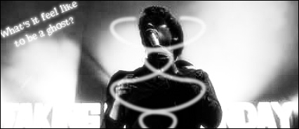
I voted for number one, overall looks best- especially in black and white. Don't get me wrong, the others are good too but there's just little things that made me not vote for them. 2: Has way too much contrast for my liking. Also the text at the bottom is very difficult to read and takes away from the focal point of the signature. I can make out what appears to be day on the right but the left is just illegible for me. Another thing I didn't like is the white lines in the center, not sure what they were supposed to be. 3: After seeing the color version, the black and white version just doesn't do justice for the signature. The blood splatter is hard to figure out its a blood splatter in the B&W (had I not seen it in color I'd think it was there for no reason). It also looks like you use the same wireframe C4D's repeatedly. They look nice but try some different ones, there's lots more that you can use. 4: Looks awesome but I don't like the scan lines much in this one. I would've held off on them personally. Overall there were some great entries this week, and Ill hopefully be making signatures again soon so I can start entering. I have to use Gimp though as the computer I have access to can't run PS CS4. Hopefully my feedback wasn't too harsh, I was trying to give some thoughts for improvement. |
|
| Author: | jsbrules2 [ May 3rd, 2009, 2:33 pm ] |
| Post subject: | Re: SOTW: Week 203 Voting |
Congratz on ur win tj, I voted for #3 also =] |
|
| Author: | Jasonmrc [ May 3rd, 2009, 4:11 pm ] |
| Post subject: | Re: SOTW: Week 203 Voting |
Very nice sig TJ, you really deserved that win. To me #4 stuck out has the best. It looks the most like it was made to be black and white. I disagree with Al3x about the scan lines, I think they suited this one well. But that's just me Chief, perhaps you could say the theme in either the title of the voting thread or before you list the entries? I don't always look at the entries threads so I don't always know what the theme is, but I almost always vote. I'm sure there are others here who would benefit from this also. |
|
| Author: | Adbot [ May 3rd, 2009, 4:11 pm ] |
| Post subject: | Register and login to get these in-post ads to disappear |
| Author: | fr0styb0w [ May 3rd, 2009, 5:53 pm ] |
| Post subject: | Re: SOTW: Week 203 Voting |
This was a very close week I would have to say #4 because of how nicely it flows and how it is simple yet unique. |
|
| Author: | Chief Snake [ May 4th, 2009, 4:17 am ] |
| Post subject: | Re: SOTW: Week 203 Voting |
Jasonmrc wrote: Chief, perhaps you could say the theme in either the title of the voting thread or before you list the entries? I don't always look at the entries threads so I don't always know what the theme is, but I almost always vote. I'm sure there are others here who would benefit from this also. That's a good idea, thanks. I'll definitely include theme information in future. |
|
| Author: | power crazy [ May 4th, 2009, 8:29 am ] |
| Post subject: | Re: SOTW: Week 203 Voting |
Black and white was painful to look at But I thought that #4 looked the coolest. I like the design mostly |
|
| Author: | Hairy Munky [ May 4th, 2009, 11:30 am ] |
| Post subject: | Re: SOTW: Week 203 Voting |
Al3X wrote: 2: Has way too much contrast for my liking. Also the text at the bottom is very difficult to read and takes away from the focal point of the signature. I can make out what appears to be day on the right but the left is just illegible for me. Another thing I didn't like is the white lines in the center, not sure what they were supposed to be. Haha, that text says "Taking Back Sunday" and I didn't put it there, it was on the stock to begin with XD. I voted for #1, all of them are really nice though. |
|
| Author: | Al3X [ May 4th, 2009, 1:43 pm ] |
| Post subject: | Re: SOTW: Week 203 Voting |
Hairy Munky wrote: Al3X wrote: 2: Has way too much contrast for my liking. Also the text at the bottom is very difficult to read and takes away from the focal point of the signature. I can make out what appears to be day on the right but the left is just illegible for me. Another thing I didn't like is the white lines in the center, not sure what they were supposed to be. Haha, that text says "Taking Back Sunday" and I didn't put it there, it was on the stock to begin with XD. I voted for #1, all of them are really nice though. I can make out the taking now so I'm assuming back is behind the person. What are the white lines though, or are they just an abstract thing? |
|
| Author: | Total Plox [ May 5th, 2009, 10:59 am ] |
| Post subject: | Re: SOTW: Week 203 Voting |
the stock quality for #2 is so bad. it's all pixelated. voted for #1 |
|
| Author: | Earth [ May 5th, 2009, 12:08 pm ] |
| Post subject: | Re: SOTW: Week 203 Voting |
oh my gosh,#4 looks amazing! |
|
| Page 1 of 1 | All times are UTC - 7 hours |
| Powered by phpBB® Forum Software © phpBB Group http://www.phpbb.com/ |
|