ehh.. haven't opened up PS in whats seemed like years.. so I was a little rusty, but I had so much fun making it:
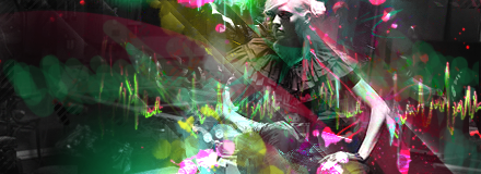
don't ask about the name XD
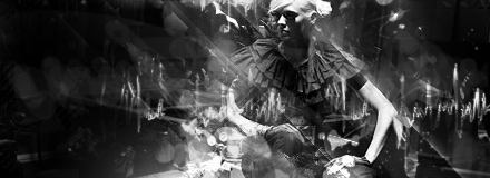
black and white (with a little added contrast):
oh and thanks Ryannub for critiquing before I posted <3
| Runescape Bits & Bytes https://www.rsbandb.com/forums/ |
|
| tosca https://www.rsbandb.com/forums/viewtopic.php?f=32&t=77702 |
Page 1 of 1 |
| Author: | Humus [ December 12th, 2009, 11:55 am ] |
| Post subject: | tosca |
ehh.. haven't opened up PS in whats seemed like years.. so I was a little rusty, but I had so much fun making it: don't ask about the name XD black and white (with a little added contrast): oh and thanks Ryannub for critiquing before I posted <3 |
|
| Author: | Adbot [ December 12th, 2009, 11:55 am ] |
| Post subject: | Register and login to get these in-post ads to disappear |
| Author: | Al3X [ December 12th, 2009, 12:06 pm ] |
| Post subject: | Re: tosca |
Color is definitely needed for this one. It looks nice but it isn't your best work. I think you covered the render up a bit too much. maybe you could try darkening the edges a bit and adding more light to the middle area. And I won't ask about the name as much as i want to. |
|
| Author: | Humus [ December 12th, 2009, 1:56 pm ] |
| Post subject: | Re: tosca |
Al3X wrote: Color is definitely needed for this one. It looks nice but it isn't your best work. I think you covered the render up a bit too much. maybe you could try darkening the edges a bit and adding more light to the middle area. And I won't ask about the name as much as i want to. XD Okay well I was going to use a font called Tosca Zero but I decided to leave the text.. but I liked the word tosca. Yeah I only made a b/w version cause a tip.it guy wanted to see.. thought I'd put it up there anyway. No not my best work I agree.. and yeah after i'd finished I could see that i'd covered over the render quite alot. I did try erasing some but obviously not enough. Thanks for the C&C. |
|
| Author: | Al3X [ December 12th, 2009, 4:35 pm ] |
| Post subject: | Re: tosca |
Humus wrote: Al3X wrote: Color is definitely needed for this one. It looks nice but it isn't your best work. I think you covered the render up a bit too much. maybe you could try darkening the edges a bit and adding more light to the middle area. And I won't ask about the name as much as i want to. XD Okay well I was going to use a font called Tosca Zero but I decided to leave the text.. but I liked the word tosca. Yeah I only made a b/w version cause a tip.it guy wanted to see.. thought I'd put it up there anyway. No not my best work I agree.. and yeah after i'd finished I could see that i'd covered over the render quite alot. I did try erasing some but obviously not enough. Thanks for the C&C. I try I'm a bit stuck on a sig currently and yours helped get me moving with some ideas |
|
| Author: | Ryan [ December 13th, 2009, 6:26 am ] |
| Post subject: | Re: tosca |
Humus wrote: oh and thanks Ryannub for critiquing before I posted <3 <3 I think the black and white version takes too much of the life away from the sig, and basically makes it look very bland. Stick to colours pl0x |
|
| Author: | Killjoy [ December 18th, 2009, 10:58 pm ] |
| Post subject: | Re: tosca |
Agreed. I think the colors are what make this sig. I actully like this signature alot. The combinations of colors work very well with the signaute. I find it hard to see what the original render was though. Mind posting a link to it? I think that fact might take away from the signature a bit also. 8/10 |
|
| Author: | Adbot [ December 18th, 2009, 10:58 pm ] |
| Post subject: | Register and login to get these in-post ads to disappear |
| Author: | Tim [ December 30th, 2009, 2:36 pm ] |
| Post subject: | Re: tosca |
With all that you have there, the black and white sig takes away from it. Color all the way with this one, good job Humus. |
|
| Page 1 of 1 | All times are UTC - 7 hours |
| Powered by phpBB® Forum Software © phpBB Group http://www.phpbb.com/ |
|