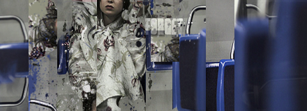
I had so much fun with this.
| Runescape Bits & Bytes https://www.rsbandb.com/forums/ |
|
| forget https://www.rsbandb.com/forums/viewtopic.php?f=32&t=74872 |
Page 1 of 1 |
| Author: | Humus [ June 11th, 2009, 12:30 pm ] |
| Post subject: | forget |
I had so much fun with this.
|
|
| Author: | Adbot [ June 11th, 2009, 12:30 pm ] |
| Post subject: | Register and login to get these in-post ads to disappear |
| Author: | Al3X [ June 11th, 2009, 3:35 pm ] |
| Post subject: | Re: forget |
Was really confusing to look at until I looked at the stock. Looks like you spliced it quite a bit. It's overall pretty good but I don't like it for my personal taste. Try altering it a little more. Maybe adjust the hue/saturation a bit. |
|
| Author: | Humus [ June 13th, 2009, 3:20 am ] |
| Post subject: | Re: forget |
Al3X wrote: Was really confusing to look at until I looked at the stock. Looks like you spliced it quite a bit. It's overall pretty good but I don't like it for my personal taste. Try altering it a little more. Maybe adjust the hue/saturation a bit. Thanks. I'll try what you said. |
|
| Author: | Mushroom Queen [ June 13th, 2009, 4:12 pm ] |
| Post subject: | Re: forget |
Excellent. But um >.< don't put white text next to light objects (ie the girl's clothes). Either move it to one of the blue spots or change the text colour altogether. Good work though. |
|
| Author: | Steven [ June 19th, 2009, 8:01 pm ] |
| Post subject: | Re: forget |
It's amazing, to be honest. just a couple of things though, for starters your text is too bright, and it's a little unreadable. My suggestion is to change the color and to change the text. Otherwise, it's perfect. |
|
| Page 1 of 1 | All times are UTC - 7 hours |
| Powered by phpBB® Forum Software © phpBB Group http://www.phpbb.com/ |
|