Runescape Bits & Bytes
https://www.rsbandb.com/forums/

First in forever
https://www.rsbandb.com/forums/viewtopic.php?f=32&t=74865
Page 1 of 1

Author:  Al3X [ June 10th, 2009, 4:29 pm ]
Post subject:  First in forever

Ya, as most of you know I finally got my new computer meaning I can get back into sig making. This was my first signature in a while so I'm still brushing up. Plus I was recording myslef for a tutorial on my new channel (TechniTuts so I was a bit nervous/feeling awkward because I had to talk to myself lol.

Image

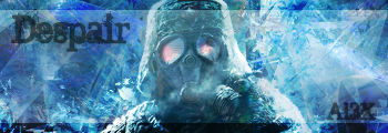
Think I finally chose some good text, the render just gives a feeling of depression and sadness.

C&C and suggestions for improving.

Ill post the link to the tut after it's uploaded if anyone is interested in seeing it.

Author:  Adbot [ June 10th, 2009, 4:29 pm ]
Post subject:  Register and login to get these in-post ads to disappear


Author:  Steven [ June 10th, 2009, 5:58 pm ]
Post subject:  Re: First in forever

It's good, but you should go back and go in it's glasses and try to make the glare blue and not red.

It's good. 5/5

Author:  Al3X [ June 10th, 2009, 6:02 pm ]
Post subject:  Re: First in forever

Steven wrote:
It's good, but you should go back and go in it's glasses and try to make the glare blue and not red.

It's good. 5/5


Was red on the original but Ill see If I can do that, and if it looks good.

Author:  Veggie Eater [ June 10th, 2009, 6:44 pm ]
Post subject:  Re: First in forever

Aw I like it. It does give an impression of depression/sadness so you definitely got your point across. [And I really like all the blue of course]

Nice job :)

Author:  Al3X [ June 10th, 2009, 7:35 pm ]
Post subject:  Re: First in forever

Veggie Eater wrote:
Aw I like it. It does give an impression of depression/sadness so you definitely got your point across. [And I really like all the blue of course]

Nice job :)


Thanks Veggie :D

Author:  Dokter Bob [ June 11th, 2009, 11:16 am ]
Post subject:  Re: First in forever

Steven wrote:
It's good, but you should go back and go in it's glasses and try to make the glare blue and not red.

It's good. 5/5


The red makes it look like the soldier is running into a sure-death battle, preferably with a lot of fire and explosions or something. And the "Despair" accompanies that pretty well. :wink:


5/5

Author:  Adbot [ June 11th, 2009, 11:16 am ]
Post subject:  Register and login to get these in-post ads to disappear


Author:  Humus [ June 11th, 2009, 11:57 am ]
Post subject:  Re: First in forever

Dokter Bob wrote:
Steven wrote:
It's good, but you should go back and go in it's glasses and try to make the glare blue and not red.

It's good. 5/5


The red makes it look like the soldier is running into a sure-death battle, preferably with a lot of fire and explosions or something. And the "Despair" accompanies that pretty well. :wink:


5/5

Yeah I agree. If you could expand the red a bit more, make it brighter and more noticeable it will make it looks better. Also the text looks a bit big. Make it smaller. :)

Page 1 of 1 All times are UTC - 7 hours
Powered by phpBB® Forum Software © phpBB Group
http://www.phpbb.com/