Runescape Bits & Bytes https://www.rsbandb.com/forums/ |
|
First sig attempt *Redone* https://www.rsbandb.com/forums/viewtopic.php?f=32&t=72143 |
Page 1 of 1 |
Author: | Al3X [ November 22nd, 2008, 12:56 pm ] |
Post subject: | First sig attempt *Redone* |
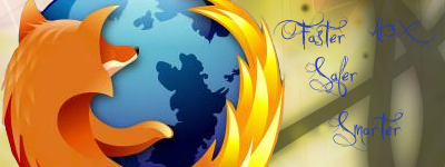
well I just made my first sig from scratch. Butchered the Firefox logo in the process though. C&C please. Spoiler for original:
edit: I just noticed a major mistake i hadnt seen before, made the firefox logo a little too high and theres a bit of a gap at the bottom ![]() edit: So I redid the signature, used different brushes, coloration, font, and cropped the render better. Heres the finished product: Spoiler for Redone:
Compare to original please ^.^ revised a bit more: (blurred edges of render, changed font to black) Spoiler for Redone V2:
|
Author: | Adbot [ November 22nd, 2008, 12:56 pm ] |
Post subject: | Register and login to get these in-post ads to disappear |
Author: | Humus [ November 22nd, 2008, 1:24 pm ] |
Post subject: | Re: First sig attempt |
Its an ok first signature. ![]() But you need to work more on the background and making it interesting. Your text is a little dull too, there are some great font sites out there with thousands of fonts to choose from so check some out like dafont. And also, you can easily get a firefox logo render here, aswell as a whole lot of other useful renders. ![]() |
Author: | Wham94 [ November 22nd, 2008, 3:28 pm ] |
Post subject: | Re: First sig attempt |
I like the background, but as said before the font isn't the best choice. |
Author: | Al3X [ November 22nd, 2008, 4:22 pm ] |
Post subject: | Re: First sig attempt |
Wham94 wrote: I like the background, but as said before the font isn't the best choice. Ya I didn't know how to get new fonts when I made it but thanks to Humus for that sight. ![]() Thanks for the thoughts guys, I might do sortve a "rework" of it later, probably not though. |
Author: | Lego Pi3 [ November 22nd, 2008, 8:02 pm ] |
Post subject: | Re: First sig attempt |
cool, but i don't really think that the background goes with that well. |
Author: | Wham94 [ November 23rd, 2008, 7:39 am ] |
Post subject: | Re: First sig attempt |
Quote: I might do sortve a "rework" of it later, probably not though. I did that with several of my sigs, they improve. Give it a shot. |
Author: | Adbot [ November 23rd, 2008, 7:39 am ] |
Post subject: | Register and login to get these in-post ads to disappear |
Author: | Rad [ November 23rd, 2008, 7:43 am ] |
Post subject: | Re: First sig attempt |
Firefox is horrible in my opinion |
Author: | Wham94 [ November 23rd, 2008, 7:44 am ] |
Post subject: | Re: First sig attempt |
Rad wrote: Firefox is horrible in my opinion Off-topic, yes? ![]() The signature is okay though. |
Author: | Al3X [ November 23rd, 2008, 1:39 pm ] |
Post subject: | Re: First sig attempt |
Wham94 wrote: Rad wrote: Firefox is horrible in my opinion Off-topic, yes? ![]() The signature is okay though. Thanks for the input ![]() Just redid it. Don't let your dislike of the render bias your opinion ![]() |
Author: | Wham94 [ November 23rd, 2008, 1:43 pm ] |
Post subject: | Re: First sig attempt *Redone* |
Looks good, but I think you should turn the font to either White or Black, whichever is more visible. Blue doesn't seem to work with the signature. But the background is greatly improved. Try just going round the edges of the firefox logo with the blur tool so it's not like you just dumped a render on a background. |
Author: | Al3X [ November 23rd, 2008, 2:01 pm ] |
Post subject: | Re: First sig attempt *Redone* |
Wham94 wrote: Looks good, but I think you should turn the font to either White or Black, whichever is more visible. Blue doesn't seem to work with the signature. But the background is greatly improved. Try just going round the edges of the firefox logo with the blur tool so it's not like you just dumped a render on a background. Ok, Ill try that. edit: ok done. ![]() |
Author: | Humus [ November 23rd, 2008, 2:31 pm ] |
Post subject: | Re: First sig attempt *Redone* |
Looks much better, now. Black font improves it by a lot. ![]() |
Author: | Wham94 [ November 23rd, 2008, 2:36 pm ] |
Post subject: | Re: First sig attempt *Redone* |
Congratulations, an excellent piece of work ![]() Have fun making more. |
Author: | Al3X [ November 23rd, 2008, 3:25 pm ] |
Post subject: | Re: First sig attempt *Redone* |
Humus wrote: Looks much better, now. Black font improves it by a lot. ![]() Wham94 wrote: Congratulations, an excellent piece of work ![]() Have fun making more. Thanks, I feel accomplished now ![]() |
Author: | Lego Pi3 [ November 23rd, 2008, 8:28 pm ] |
Post subject: | Re: First sig attempt *Redone* |
cool! the redone v2 is really cool. |
Page 1 of 1 | All times are UTC - 7 hours |
Powered by phpBB® Forum Software © phpBB Group http://www.phpbb.com/ |