so hot..
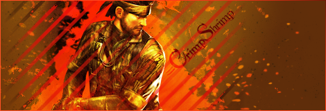
for those who are wondering, =CrimpShrimp is my deviantart account...
| Runescape Bits & Bytes https://www.rsbandb.com/forums/ |
|
| its getting hot in here... https://www.rsbandb.com/forums/viewtopic.php?f=32&t=67274 |
Page 1 of 1 |
| Author: | Humus [ May 26th, 2008, 8:38 am ] |
| Post subject: | its getting hot in here... |
so hot.. for those who are wondering, =CrimpShrimp is my deviantart account... |
|
| Author: | Adbot [ May 26th, 2008, 8:38 am ] |
| Post subject: | Register and login to get these in-post ads to disappear |
| Author: | Mushroom Queen [ May 27th, 2008, 2:32 pm ] |
| Post subject: | Re: its getting hot in here... |
Can't believe no one's replied to this yet. I love how the edges of the background look simple and then transition into a bright fiery look. I'd rather see the text be a brighter shade of orange/red so it stands out more. And, the black dots on the background would do better if they weren't there (or turned brown). Great job though, Humus! It's a good sig that draws your eye right to the render and text. |
|
| Author: | Humus [ May 29th, 2008, 8:01 am ] |
| Post subject: | Re: its getting hot in here... |
Mushroom Queen wrote: Can't believe no one's replied to this yet. I love how the edges of the background look simple and then transition into a bright fiery look. I'd rather see the text be a brighter shade of orange/red so it stands out more. And, the black dots on the background would do better if they weren't there (or turned brown). Great job though, Humus! It's a good sig that draws your eye right to the render and text. Thanks, Mq! With the text, I know its kinda lazy, but I just wanted to kind of finish the sig off quickly hehe.. All of it was more of a mess-around, experimental kinda thing. |
|
| Author: | power crazy [ May 31st, 2008, 11:15 am ] |
| Post subject: | Re: its getting hot in here... |
Nice, those look pretty sweet |
|
| Page 1 of 1 | All times are UTC - 7 hours |
| Powered by phpBB® Forum Software © phpBB Group http://www.phpbb.com/ |
|