It's been a long time since i last made a forum sig so decided to see what would happen if i tried to make some again and this is the result.


been trying a lot of different techniques so some constructive criticism would be nice
| Runescape Bits & Bytes https://www.rsbandb.com/forums/ |
|
| Newest sig, added another https://www.rsbandb.com/forums/viewtopic.php?f=32&t=63758 |
Page 1 of 1 |
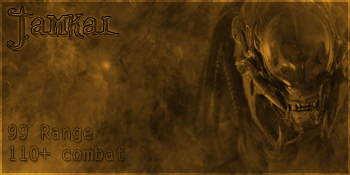
| Author: | Jamkal [ February 14th, 2008, 9:36 pm ] |
| Post subject: | Newest sig, added another |
It's been a long time since i last made a forum sig so decided to see what would happen if i tried to make some again and this is the result. been trying a lot of different techniques so some constructive criticism would be nice |
|
| Author: | Adbot [ February 14th, 2008, 9:36 pm ] |
| Post subject: | Register and login to get these in-post ads to disappear |
| Author: | patrick [ February 15th, 2008, 8:25 am ] |
| Post subject: | Re: Newest sig |
8/10 Shows great abilites in photoshop and looks professional but It seems as if I've seen similar signatures before . Good try ! |
|
| Author: | Kirby [ February 18th, 2008, 7:06 am ] |
| Post subject: | Re: Newest sig, added another |
Great job! I like the textures to the backgrounds. The text could do a bit better, but it is pretty excellent at the moment. The last signature, as you can see, is the same render I used for one of my signatures. |
|
| Author: | Jamkal [ February 18th, 2008, 9:15 am ] |
| Post subject: | Re: Newest sig, added another |
Kirby wrote: Great job! I like the textures to the backgrounds. The text could do a bit better, but it is pretty excellent at the moment. The last signature, as you can see, is the same render I used for one of my signatures. Yeah i quite like that render it seems to fit with pretty much anything used the same one in one of the first few signatures i did for a friend |
|
| Author: | Unbirthday [ February 18th, 2008, 9:25 am ] |
| Post subject: | Re: Newest sig, added another |
You make good color choices when it comes to matching. 8/10. However I don't like the shape of them. Oh well. XD |
|
| Author: | Jamkal [ February 18th, 2008, 11:35 am ] |
| Post subject: | Re: Newest sig, added another |
Zac Glenn wrote: You make good color choices when it comes to matching. 8/10. However I don't like the shape of them. Oh well. XD By the shape you mean the height and width/length i use or do you mean something else? |
|
| Author: | Adbot [ February 18th, 2008, 11:35 am ] |
| Post subject: | Register and login to get these in-post ads to disappear |
| Author: | Kenny [ February 20th, 2008, 2:21 pm ] |
| Post subject: | Re: Newest sig, added another |
I like the second and third ones purely because of the themes and backrounds. Try a diffrent style other than picture one side - text the other. |
|
| Author: | Jamkal [ February 21st, 2008, 7:31 am ] |
| Post subject: | Re: Newest sig, added another |
Kenny wrote: I like the second and third ones purely because of the themes and backrounds. Try a diffrent style other than picture one side - text the other. Perhaps but I'm not to sure on what other styles their are I've always been told never to have text over the render or even brush over the render Perhaps you could give me a few ideas on different styles please. |
|
| Author: | Shadow Assassin [ February 22nd, 2008, 7:33 am ] |
| Post subject: | Re: Newest sig, added another |
The 2nd one was my favorite, great job! |
|
| Page 1 of 1 | All times are UTC - 7 hours |
| Powered by phpBB® Forum Software © phpBB Group http://www.phpbb.com/ |
|