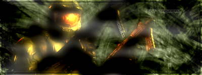
Well, first in months. I think it turned out nicely! What about you?
EDIT: 400th post!
EDIT2:
One with mist and one without.
| Runescape Bits & Bytes https://www.rsbandb.com/forums/ |
|
| First in a Looong Time: "Get Tactical" https://www.rsbandb.com/forums/viewtopic.php?f=32&t=41601 |
Page 1 of 1 |
| Author: | kingofrogue0 [ November 18th, 2006, 12:03 am ] |
| Post subject: | First in a Looong Time: "Get Tactical" |
|
Well, first in months. I think it turned out nicely! What about you? EDIT: 400th post! EDIT2:
One with mist and one without. |
|
| Author: | Adbot [ November 18th, 2006, 12:03 am ] |
| Post subject: | Register and login to get these in-post ads to disappear |
| Author: | Mushroom Queen [ November 18th, 2006, 12:10 am ] |
| Post subject: | |
Hmm.. I'm not so sure about th is one. The white mist looks weird since it overlaps the render and the background just looks like brush-splatters. The render doesn't look to great either with the blurry glow effect. Not to mention the text... Gah, KOR, this sig has problems! When you look at a sig, you want to have a focus (usually on the render). This render doesn't work well with the background at all. I'd suggest a slightly more yellow background. I'd also suggest using default brushes and textures for the background. Nothing kills a sig more than to just see a set of fractal brushes painted onto a white canvas with tweaks in hue and saturation. Using more than one colour is super, but here it's not working. The low-opacity pixel text really doesn't do justice either. Getting back into doing graphics can sometimes be challenging. My advice to look at your old sigs (if you don't have them saved anymore, look up your old posts) and try to carry on from there. |
|
| Author: | kingofrogue0 [ November 18th, 2006, 12:16 am ] |
| Post subject: | |
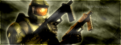
Heh, see, I tried yellow, but it looked butt-ugly to me. Maybe I'll give that a shot. Also, I used brushes frm a C4D render, they're not fractal Thanks for the advice. Like I said, it's been a while. |
|
| Author: | Mushroom Queen [ November 18th, 2006, 12:26 am ] |
| Post subject: | |
Hrmmm..It's a little flat looking for a c4d, don't you think? Sorry for classing it as a typical fractal brush |
|
| Author: | kingofrogue0 [ November 18th, 2006, 12:37 am ] |
| Post subject: | |
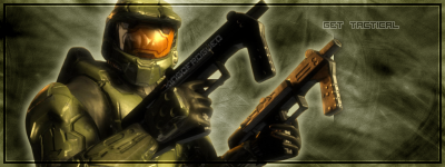
Whoops, yellow didn't work because I had "Preserve Luminosity" checked. Now it looks great Added 2 more versions to the main post |
|
| Page 1 of 1 | All times are UTC - 7 hours |
| Powered by phpBB® Forum Software © phpBB Group http://www.phpbb.com/ |
|