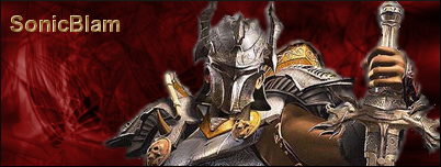
a sig i made for my brother... I didn't match the background color correctly lol
just messing around and got this
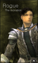
and finaly an avatar i made today for a guild wars forum that i'm on
| Runescape Bits & Bytes https://www.rsbandb.com/forums/ |
|
| Three new ones https://www.rsbandb.com/forums/viewtopic.php?f=32&t=23638 |
Page 1 of 1 |
| Author: | Total Rogue [ December 21st, 2005, 7:18 pm ] |
| Post subject: | Three new ones |
|
a sig i made for my brother... I didn't match the background color correctly lol
just messing around and got this and finaly an avatar i made today for a guild wars forum that i'm on |
|
| Author: | Adbot [ December 21st, 2005, 7:18 pm ] |
| Post subject: | Register and login to get these in-post ads to disappear |
| Author: | Mushroom Queen [ December 23rd, 2005, 4:06 pm ] |
| Post subject: | |
The first one: the red background doesn't go well, in my opinion. I don't know if you were trying to symbolise BLOODSHED or something..but I think it'd look a lot nicer with an orange one instead. The text is very plain looking, it looks like you just used a default font and added a bevel effect to it. Dress up the text more and use a better font. The second one: You spelled "innovation" wrong. I also think it'd be better if you moved the text closer to "Rogue." Looks fine though. The third one: Looks alright, too. |
|
| Page 1 of 1 | All times are UTC - 7 hours |
| Powered by phpBB® Forum Software © phpBB Group http://www.phpbb.com/ |
|