Rate it.
| Runescape Bits & Bytes https://www.rsbandb.com/forums/ |
|
| Halloween sig https://www.rsbandb.com/forums/viewtopic.php?f=32&t=19922 |
Page 1 of 2 |
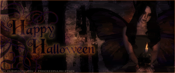
| Author: | Mushroom Queen [ October 27th, 2005, 10:47 pm ] |
| Post subject: | Halloween sig |
Rate it.
|
|
| Author: | Adbot [ October 27th, 2005, 10:47 pm ] |
| Post subject: | Register and login to get these in-post ads to disappear |
| Author: | Priss [ October 28th, 2005, 3:27 am ] |
| Post subject: | |
9.5/10 It looks really smoot. I saw what you said on the SOWT and yes the border itsn't the best. But I think its the best it goes with it. I have no ideas what we could do with the border other than that. |
|
| Author: | - Tom - [ October 28th, 2005, 4:46 am ] |
| Post subject: | |
everyone here makes too dark sigs |
|
| Author: | murdererdood [ October 28th, 2005, 6:28 am ] |
| Post subject: | |
thats amazing |
|
| Author: | Crysala [ October 28th, 2005, 7:04 am ] |
| Post subject: | |
is that one for me too? |
|
| Author: | ziggysdragon [ October 28th, 2005, 9:33 am ] |
| Post subject: | |
nice |
|
| Author: | Adbot [ October 28th, 2005, 9:33 am ] |
| Post subject: | Register and login to get these in-post ads to disappear |
| Author: | Kronic [ October 28th, 2005, 10:28 am ] |
| Post subject: | |
a great looking sig! once again a dark theme, but hey, everyone's got their own styles overall 9/10 |
|
| Author: | Mushroom Queen [ October 28th, 2005, 12:23 pm ] |
| Post subject: | |
I'll try to incorporate bunnies and flowers in the next one. I promise! |
|
| Author: | czskrazzi [ October 28th, 2005, 5:45 pm ] |
| Post subject: | |
ziggysdragon wrote: nice helps if you post more than just one word.. Like a constructive comment or something.. Mushroom Queen wrote: I'll try to incorporate bunnies and flowers in the next one. I promise!
bunnies and flowers are for, hmm, well i dunno, just seem to fruity for me I like this sig. Yes it looks dark, but the black bg of the forums helps make it look alot darker. It is a halloween sig after all, so the theme would be, black, orange, dark colors, scary creatures etc. Now about the border, i dont see whats wrong with it? i guess theonly noticable thing would be its alot brighter than the rest of the sig.. But if it was darker , it would blend with the darker colors and you prolly wouldnt see the border much.. I rate 9.8/10 only becuz i think the fairy/butterfly lady looks alil too innocent for halloween |
|
| Author: | dracun [ October 28th, 2005, 6:46 pm ] |
| Post subject: | |
Haha, you have my backup on the sotw, I'm rooting for that sig |
|
| Author: | Mushroom Queen [ October 28th, 2005, 6:51 pm ] |
| Post subject: | |
Thanks for your comments, guys! Yeah, she does look a little innocent, doesn't she? I'm glad no one has pointed out how her fingers look deformed. In the words of my friends, "It looks like she has the fingers of a placenta." |
|
| Author: | zante4950 [ October 29th, 2005, 8:33 pm ] |
| Post subject: | |
whats the word im looking for..... disturbing i like it tho |
|
| Author: | Jiffy [ October 30th, 2005, 8:33 am ] |
| Post subject: | |
Awesome. 9/0. I think the reason everyones sig looks dark is because of the black bg on the forums. like fi I host my sig on deluxegfx the text is white not a dark grey. |
|
| Author: | Litis [ November 1st, 2005, 9:23 am ] |
| Post subject: | |
9/0, Jiffy? Haha, I wouldn't rate the sig like that I give it... 9.5/10. Nice job 'xcept it's dark. But, nice job again. |
|
| Author: | Z4ck [ November 1st, 2005, 2:13 pm ] |
| Post subject: | |
Kinda well...Dark...Its cool though all the same |
|
| Page 1 of 2 | All times are UTC - 7 hours |
| Powered by phpBB® Forum Software © phpBB Group http://www.phpbb.com/ |
|